How To Switch To New Facebook Desktop Design and Turn On Dark Mode - Android
Today, March 20, 2020, Facebook officially rolled out its revamped design for the website's desktop version.
The refreshed look features a responsive layout that changes the position of some sections depending on the screen size and resolution. It also comes replete with bigger icons and more prominent buttons that will make navigating the site easier. I'd say the most notable change in this new design is that there's now a Dark Mode, which many users have long been waiting for.

There are currently two ways by which you can switch to the New Facebook Desktop Design.
First is by clicking on the "Try It" button on the invitation to try out the new design that you will find on the top part of your "old" timeline.

When you click on it for the first time, you will see a couple of pop-up messages from Facebook about the changes that they made to the website.
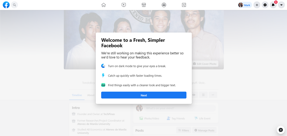
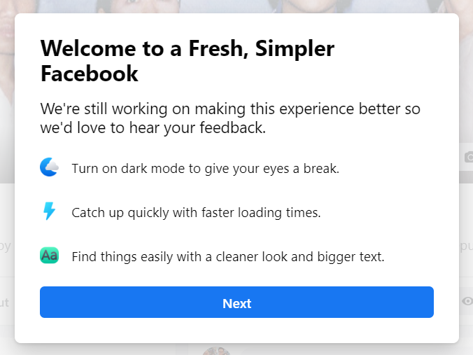
The first one gives you details about the three key changes that Facebook implemented on the design change.
1. As I've shared above, you can now turn on Dark Mode, which - according to Facebook - helps give your eyes a break.
2. I've yet to test this but "New Facebook" is supposed to have faster loading times.
3. You can find things more easily with the site's cleaner look and bigger text.
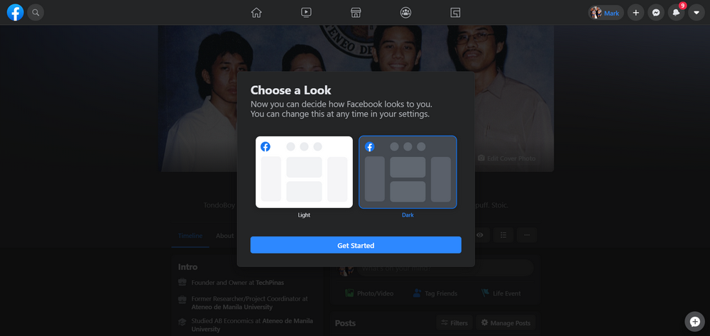
From there, you can also choose the look that you want; Either Light or Dark Mode. Just tap the one you like and click on the "Get Started" button. You may also change this at any time in your settings, which I will show you later.
Now, if you're not seeing Facebook's invitation to switch to the new look on the top section of your timeline, you can also turn it on by clicking on the Down Arrow in the upper right corner of your screen as shown in the image below.
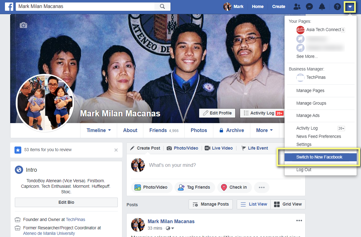
Then, simply click on the "Switch to New Facebook" option. Doing this will immediately change the old look to the new one with no pop-up messages.
If you are not seeing this option, try logging out of your account and logging in again.

To turn on or turn off "Dark Mode" in this New Facebook Dekstop Design, click on the same Down Arrow arrow in the upper right corner and tap the switch in the Dark Mode option. So easy!
Just like the mobile version for iOS and Android, the new Facebook for Desktop has five main sections not counting your own Timeline.
Like in the old version, the Home Screen is where you will find the post of your friends and pages that you follow closely. There's also a section there for all of your buds' Facebook Live videos.
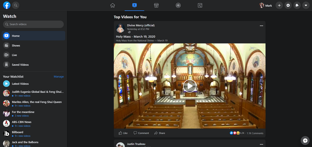
"Watch" is the section where you will find the top videos by Facebook Pages that you follow or trending ones that many of your friends have liked and shared.
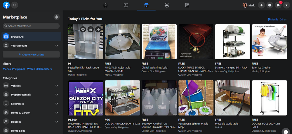
"Marketplace" is where you will find items that are being sold by other Facebook users. In the new version, the layout is even more buyer-friendly with a more prominent search box and cleaner overall look.
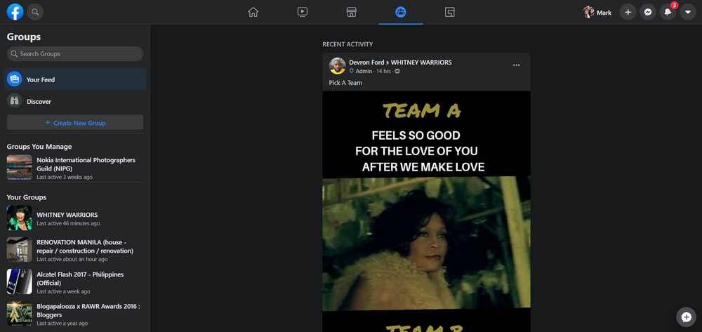
"Groups" contains updates by Facebook Groups that you closely follow.
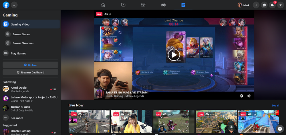
Finally, "Gaming" is where you will see ore-recorded clips and livestream videos by your favorite online and mobile gamers.
Do you like the New Facebook Desktop Design compared to the older version? Have you completely switched to it or do you keep coming back to what you were used to? How do you think Facebook can improve this revamp? Let me know in the comments section below.
The refreshed look features a responsive layout that changes the position of some sections depending on the screen size and resolution. It also comes replete with bigger icons and more prominent buttons that will make navigating the site easier. I'd say the most notable change in this new design is that there's now a Dark Mode, which many users have long been waiting for.

There are currently two ways by which you can switch to the New Facebook Desktop Design.
First is by clicking on the "Try It" button on the invitation to try out the new design that you will find on the top part of your "old" timeline.

When you click on it for the first time, you will see a couple of pop-up messages from Facebook about the changes that they made to the website.

The first one gives you details about the three key changes that Facebook implemented on the design change.
1. As I've shared above, you can now turn on Dark Mode, which - according to Facebook - helps give your eyes a break.
2. I've yet to test this but "New Facebook" is supposed to have faster loading times.
3. You can find things more easily with the site's cleaner look and bigger text.

From there, you can also choose the look that you want; Either Light or Dark Mode. Just tap the one you like and click on the "Get Started" button. You may also change this at any time in your settings, which I will show you later.

Now, if you're not seeing Facebook's invitation to switch to the new look on the top section of your timeline, you can also turn it on by clicking on the Down Arrow in the upper right corner of your screen as shown in the image below.

Then, simply click on the "Switch to New Facebook" option. Doing this will immediately change the old look to the new one with no pop-up messages.
If you are not seeing this option, try logging out of your account and logging in again.

To turn on or turn off "Dark Mode" in this New Facebook Dekstop Design, click on the same Down Arrow arrow in the upper right corner and tap the switch in the Dark Mode option. So easy!
Just like the mobile version for iOS and Android, the new Facebook for Desktop has five main sections not counting your own Timeline.
Like in the old version, the Home Screen is where you will find the post of your friends and pages that you follow closely. There's also a section there for all of your buds' Facebook Live videos.
"Watch" is the section where you will find the top videos by Facebook Pages that you follow or trending ones that many of your friends have liked and shared.

"Marketplace" is where you will find items that are being sold by other Facebook users. In the new version, the layout is even more buyer-friendly with a more prominent search box and cleaner overall look.

"Groups" contains updates by Facebook Groups that you closely follow.

Finally, "Gaming" is where you will see ore-recorded clips and livestream videos by your favorite online and mobile gamers.

Do you like the New Facebook Desktop Design compared to the older version? Have you completely switched to it or do you keep coming back to what you were used to? How do you think Facebook can improve this revamp? Let me know in the comments section below.
20/03/2020 09:05 AM
- HEALTH
- Comics
- Libraries & Demo
- Sports Games
- Racing
- Photography
- Transportation
- Media & Video
- Sports
- Health & Fitness
- Weather
- Medical
- Cards & Casino
- Arcade & Action
- Personalization
- Social
- Communication
- Productivity
- Casual
- Shopping
- Tools
- Brain & Puzzle
- Business
- News & Magazines
- Finance
- Lifestyle
- Music & Audio
- Entertainment
- Travel & Local
- Books & Reference
- Education